Getting started with Webflow


Webflow is one of the most popular SaaS tools that promises its users ease of use when it comes to building websites without writing code. So, when the author of the project I contribute to decided to move all his marketing pages to Webflow, I took the opportunity to explore it. (p.s: there are quite a number of images for references)
Getting Started
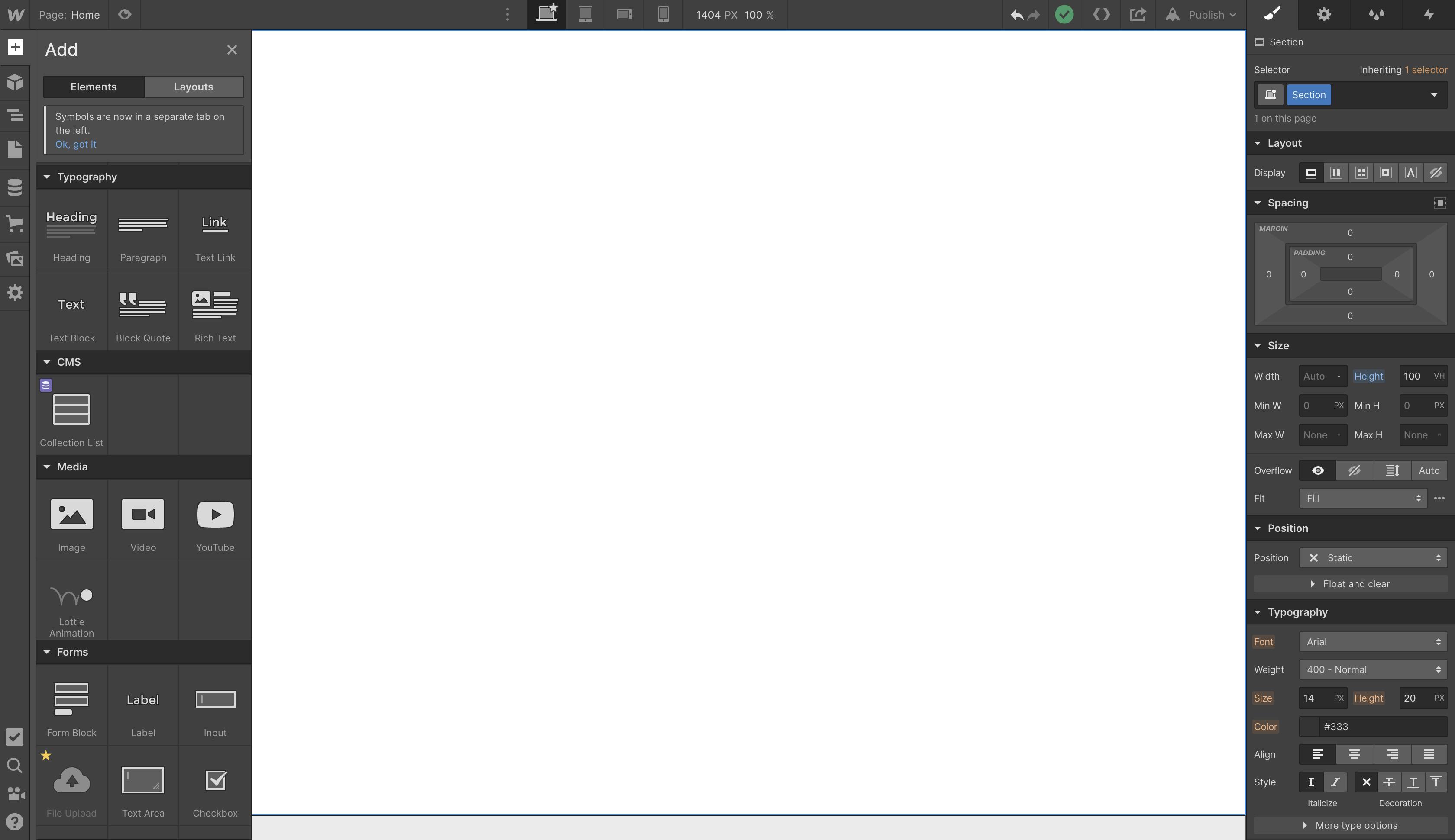
Webflow has an easy signup and email verification process which has to be completed before the user is redirected to the editor to get started. It has a sidebar that offers users a vast number of tools grouped under similar uses. This includes elements, layout, typography, building blocks (divs, buttons, list ...etc) as well as a media section. Check the image below to see what the editor looks like.
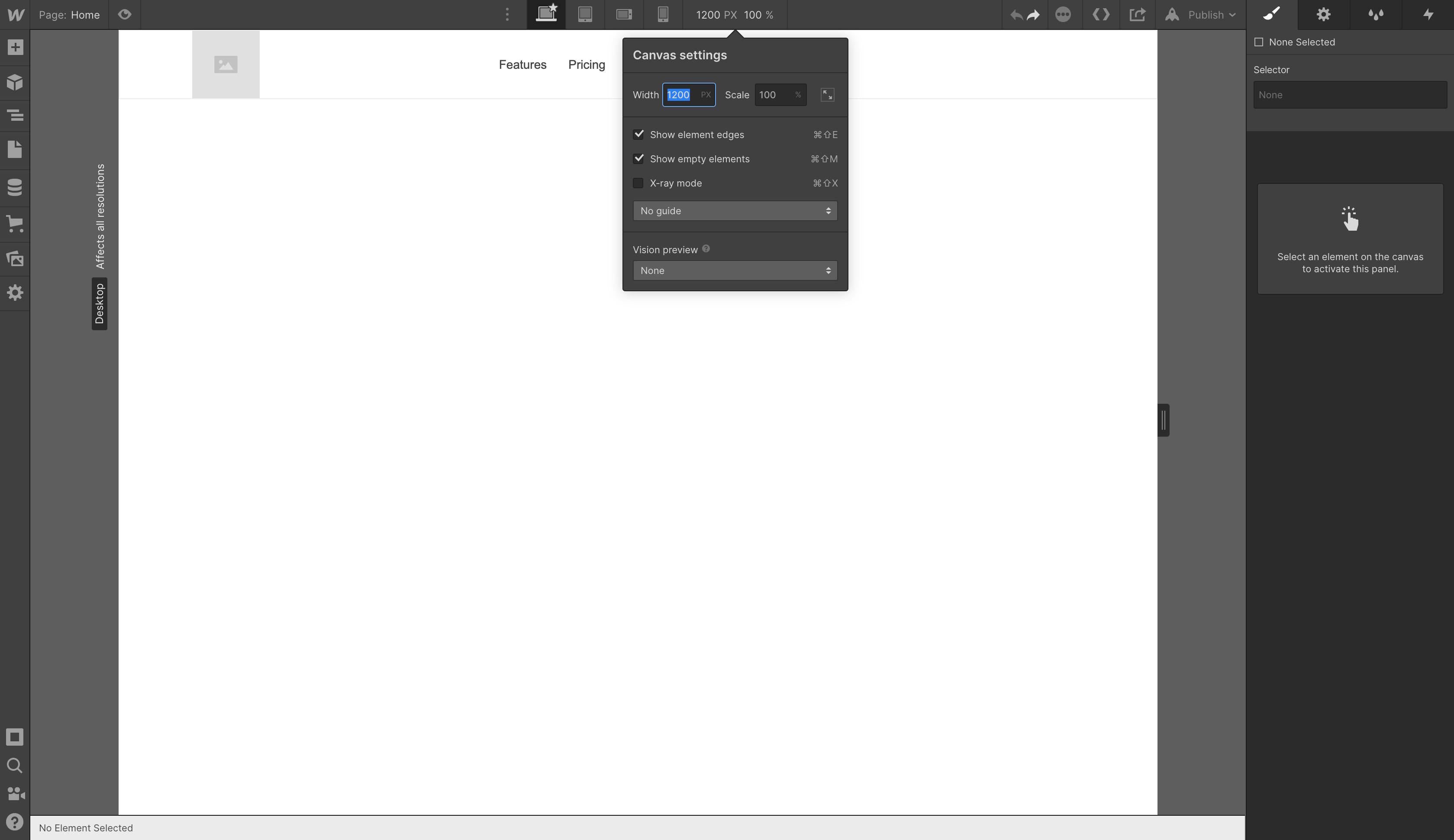
Webflow makes provision for desktops, tablets, mobile landscape, and mobile portrait views. It also has a settings view where you can adjust the width of a selected item to whatever you see fit. This means as a user, you can carve out what you want your website to look like when it is viewed on different devices, without writing any media queries code. Pretty cool, huh?!
For my first task, I am going to be creating the nav header for a sample marketing page. The header view is going to be displayed differently depending on the device size. I intend to do a full display for the desktop view and then vertically stack the nav items for both the tablet and mobile views.
The header is going to follow this structure:
> Header (div.header)
    > Brand Name/Logo (div.brand-nav)
        > Logo Image/Title (<img /> or <h2>Title here</h2>)
    > Navigation list of links (ul.nav-list)
         > Navigation list 1 (li.nav-link)
         > Navigation list 2 (li.nav-link)
         > Navigation list 3 (li.nav-link)
         > Navigation list 4 (li.nav-link)
To build a standard navigation bar, you can either use the navbar component that Webflow provides as shown in the image below or you can build your own. I'll be building my own here just to test it out.
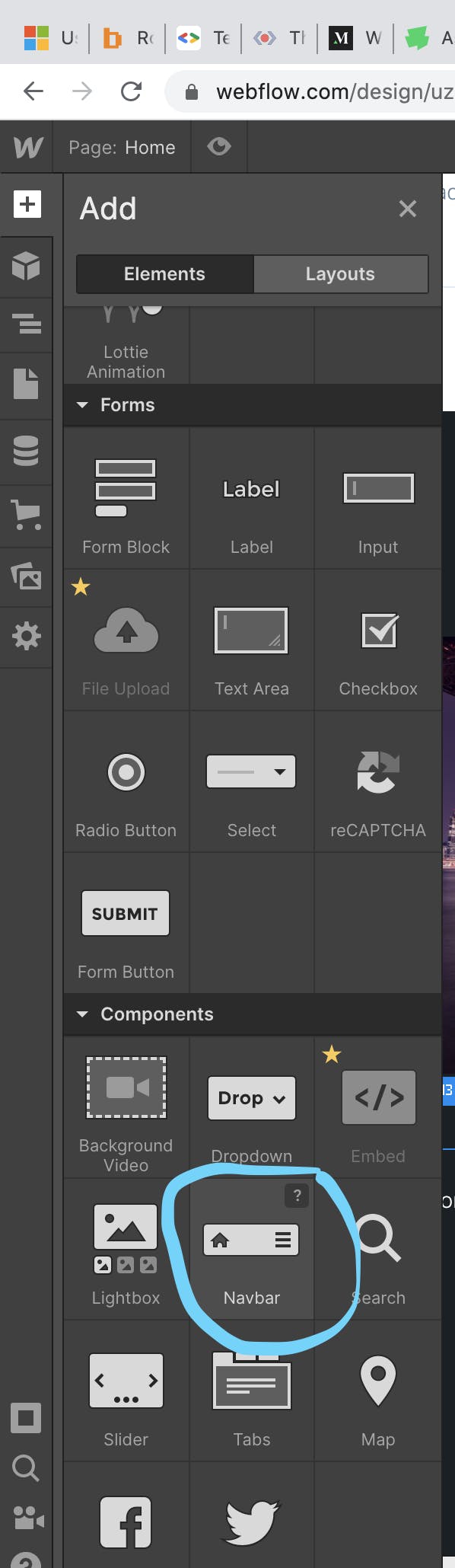 (Webflow has an in-built navigation component that offers standard header nav elements)
With Webflow, you can either drag and drop a selected item or you can just click and watch it get automatically placed on the screen based on the flow of the page. Here's what the result looks like below:
 (What the navigation bar looks like on a desktop ( >991px))
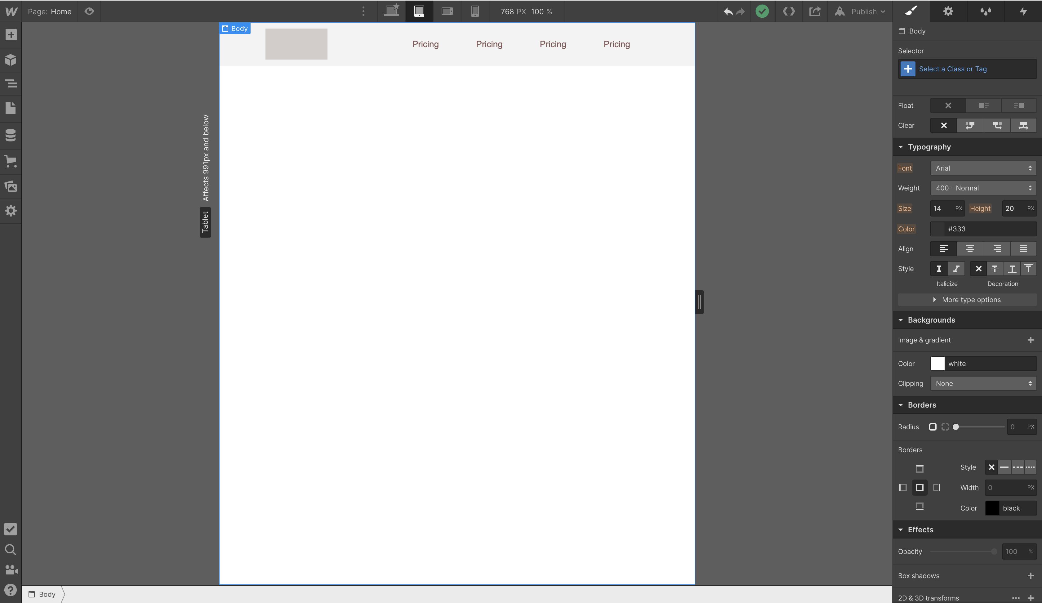 (What the navigation bar looks like on a tablet ( <991px))
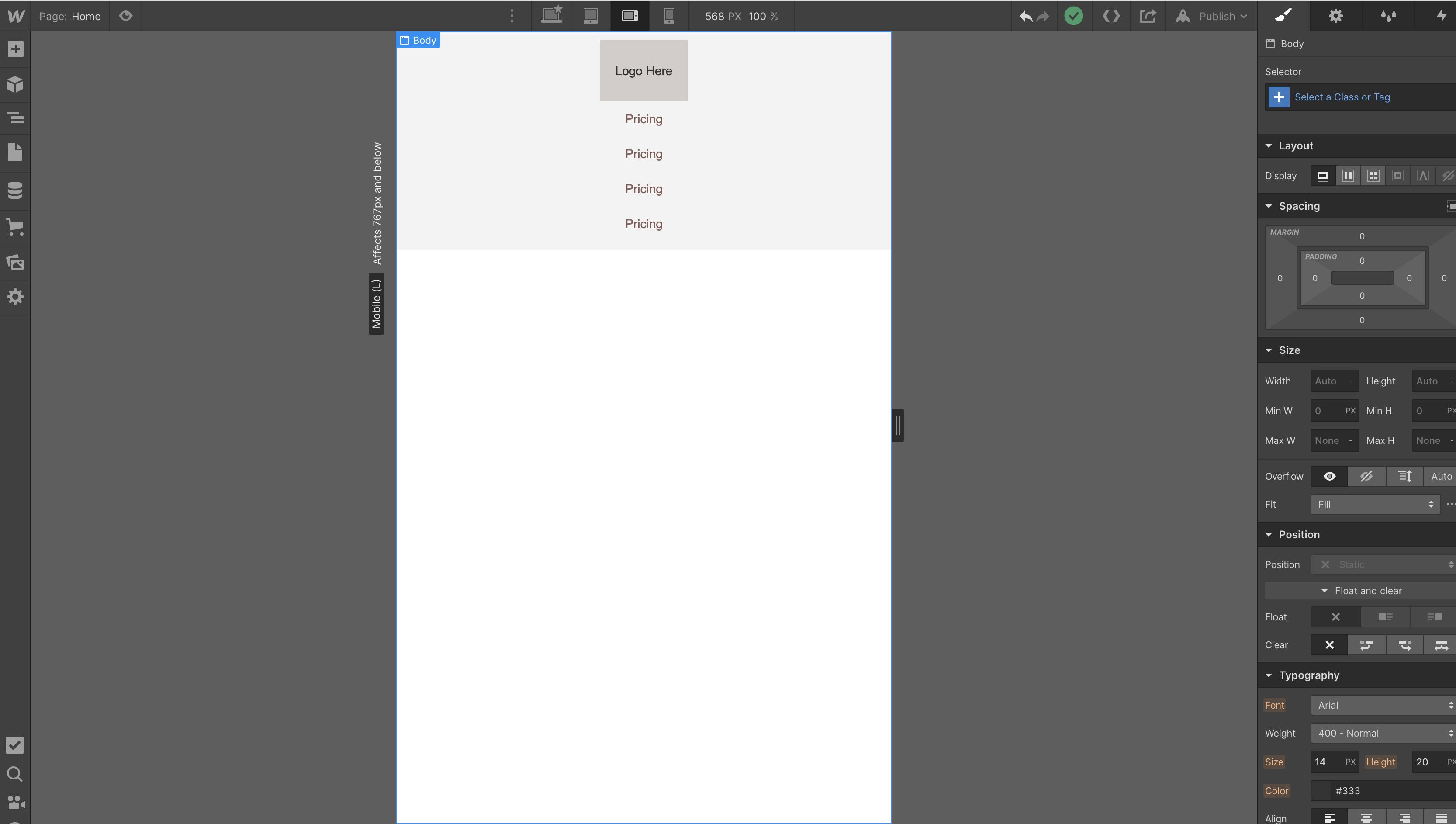 (What the navigation bar looks like on mobile ( <767px landscape view ))
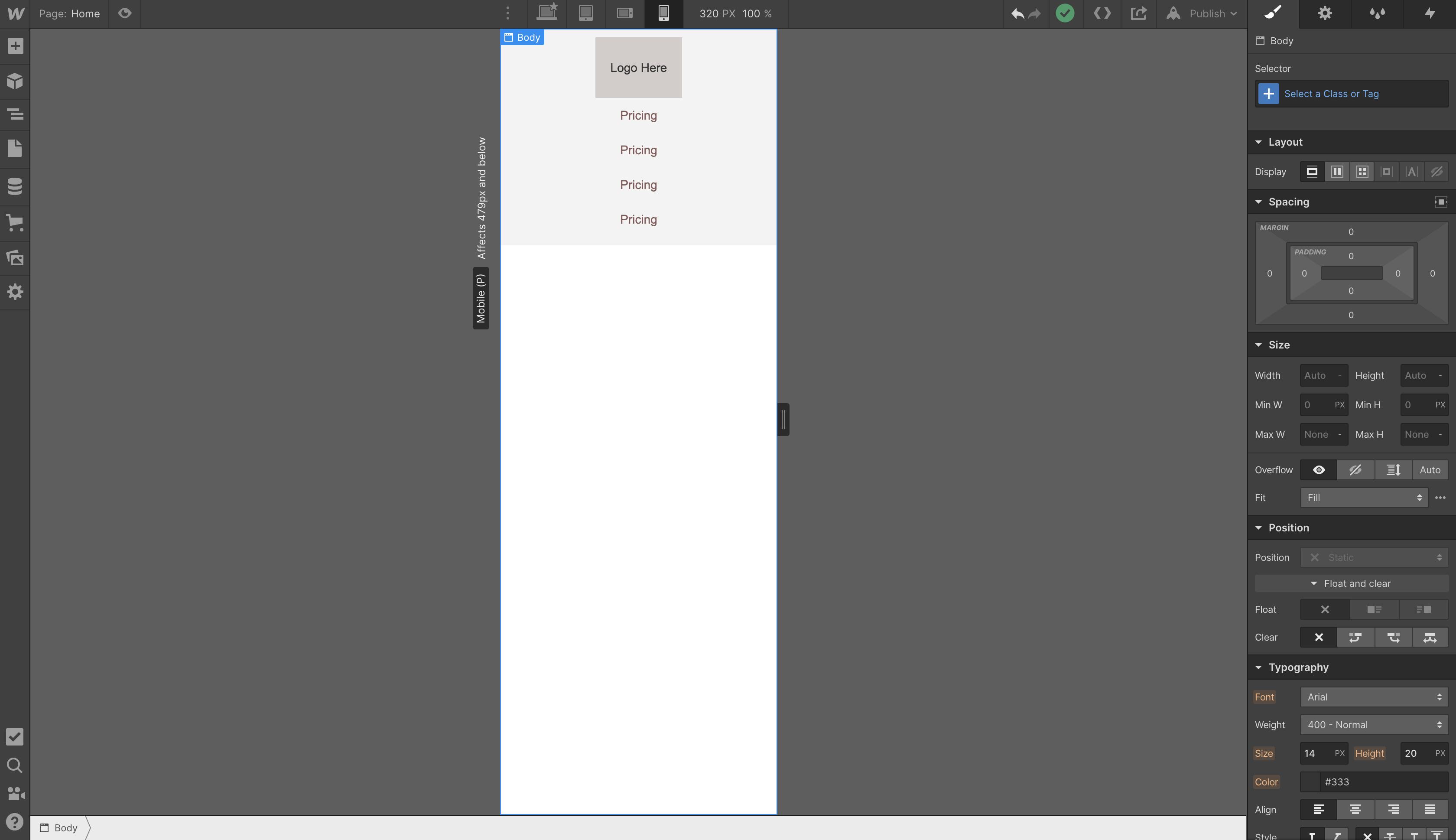 (What the navigation bar looks like on mobile ( <479px potrait view ))
This is just one of the things that you can build in Webflow. There are other amazing things to do in Webflow. To get started, you can check out their YouTube channel here .
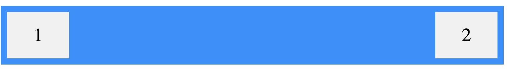
As much as I enjoyed using this tool, it also had a few things I found difficult to navigate. One of which was the 'justify-content' option for a flex container.
Webflow calculates "justify-content: space-between" for flex items differently from the browser. Where the browser calculates the "space-between" value of a flex container by displaying the flex items of the container with space between them, Webflow calculates its "space-between" value by distributing space evenly from start to end. This happens to be the browser's equivalent of "space-evenly". Since I couldn't get the children of the flex container to be distributed at opposite ends of the container, I decided to use float (L and R) to get the type of space distribution I was looking for.
 (Webflow's rendering of justify-content: space-between on a flex container)
 (The browser's rendering of justify-content: space-between on a flex container)
That's it, folks! I hope you found this helpful.